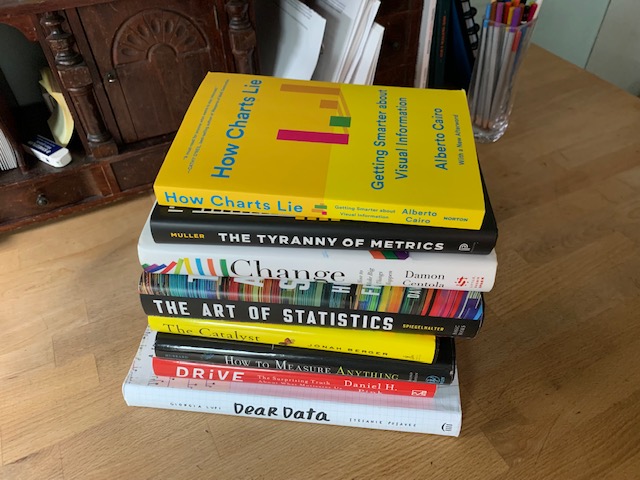
Book Club — How Charts Lie: Getting Smarter about Visual Information

Data visualization is trendy for a reason. How Charts Lie by Alberto Cairo describes how well-designed charts and graphs can help make numbers clear, especially as competition for readers’ attention grows. But badly designed charts can confuse or even lie to the reader. Healthcare is more confusing than most areas so deceptive charts are more common and more harmful. This book is an important complement to the gold standard How to Lie with Statistics, and considerably more up to date. The book takes the reader through the causes of faulty charts – poor design, dubious data, insufficient data, concealing or confusing uncertainty, and suggesting misleading patterns. He ends by showing how not to lie to yourself or others with charts. Entertaining and no math makes the book very easy to read.

